Samsung Omnia i900 Reviews
Sponsored link
Samsung's phones are as widespread and popular as Nokias these days and that success has come as a result of consistently producing sleek, good-looking handsets with mass appeal. But Samsung also wants a slice of the iPhone action, it would seem, and has made a big effort to produce one of its very own.
The Omnia, like the HTC Touch Diamond, is based on Windows Mobile Professional 6.1 and like the Diamond it replaces large parts of Microsoft's ugly and fiddly smartphone user interface with one of Samsung's design in an attempt to provide an iPhone-style touch screen experience.
Physically, it's very similar to the iPhone 3G, much more so than the Diamond, complete with slim, candybar form factor, a large screen dominating the front panel and minimalist controls. Compare the phones side by side and you'll find that dimensions are remarkably similar too, though the Omnia is a little slimmer, narrower and shorter than the iPhone 3G, at 12.5 x 112 x 56.9mm compared to 12.3 x 115.5 x 62mm.

So how exactly does it stack up elsewhere? Well, as you'd expect from a modern Windows smartphone, there's a pile of features and many of these appear to match or outstrip the iPhone 3G equivalent. It has a five-megapixel camera on the rear with an LED flash and a VGA video call camera on the front - the iPhone's is three megapixels less and it has no video call feature. It also has HSDPA of up to 7.2Mb/sec, a 624MHz processor, Bluetooth, Wi-Fi, a GPS receiver and an FM radio. Plus it comes with a decent helping of storage – either 8GB or 16GB with microSD expansion as well.
Its screen, however, at 3.2 inches isn't quite as luxuriously spacious as the iPhone's and its 400 x 280 resolution is also inferior. There's also no 3.5mm headphone socket and though a conversion dongle is included in the box, we'd sooner not have to carry an adapter around just to listen to music and it seems a needless oversight given the capacious storage on offer.
The camera, however, is the main highlight here. Its resolution is the main headline: five megapixels is the highest resolution I've seen in a Windows Mobile device, but it also has image stabilisation, which means you don't have to rely on the less-than-ideal LED 'flash' in difficult lighting. The results are impressive. Inevitably given the pinhole lens shots are a little noisy in low light and focus a touch soft, but they're more than acceptable. You can use the Omnia for proper snaps - not just contact profile pictures.
Surprisingly for a Windows Mobile device, the Omnia also boasts iPhone-like speed and responsiveness and it's a darned site nippier than the HTC Touch Diamond - even with the Diamond's latest firmware applied. Applications launch speedily, browsing the web on the phone's superb Opera Mobile 9.5 web browser is zippy and the accelerometer, which rotates the orientation of the screen from portrait to landscape as you flip the phone around in your hand, works just as you would expect it to, complete with fancy animations.

Samsung's touch-driven user interface is a valiant effort at dealing with the inadequacies of Windows Mobile's UI, too. Interestingly, Samsung provides no stylus stowage on the Omnia – the stylus attaches to the phone's lanyard loop instead. This wouldn't be an issue, of course, but unfortunately the one key area where the Omnia can't compete is with the iPhone's beautifully elegant operating system.
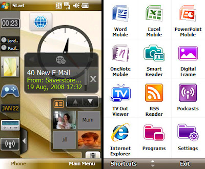
It starts well. When you first fire the phone up you're confronted with a blank screen and a scrolling toolbar arranged down the left hand side. This contains a number of attractive, graphical widgets that you can drag into to the blank space to display stuff like recent emails, the time, currently playing music tracks, phone profile, calendar, analogue and digital clocks and so on.

These don't just display information, though, they provide basic controls too, so not only can you see who your most recent email is from, you can also click it to read it in full, or scroll back to see who the previous mail was from. Music tracks can be paused and skipped and favourite contacts can be added or removed as well.
It's an interesting approach and allows you to completely customise the front end of the phone. It's easy to get a little over enthusiastic and clutter the screen to such an extent that it becomes unusable, but fortunately stowing away widgets you're not using is simple - you simply drag them back over to the toolbar.

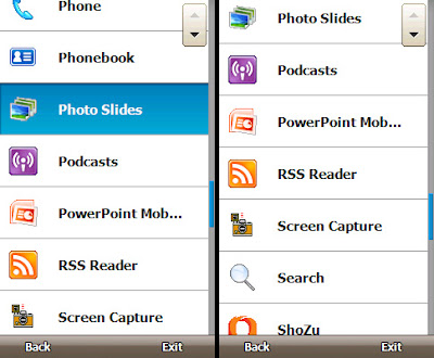
There's also a more standard grid-based launcher application, accessed via one of the soft keys at the bottom of the screen. From here you can access all the phone's main applications via finger-friendly touch-screen buttons. Many of Windows Mobile's most commonly used tools have had a proper touch-screen makeover, too. The alarm clock - a feature I use all of the time - no longer requires prodding with a stylus; the phone book has oversized entries and the music player is much easier to get on with.
Even the phone's web browser - Opera Mobile 9.5 - has been tweaked a little to make it easier to use: slide your finger up and down the right of the screen and a zoom control appears, adding the ability to make fine adjustments to the standard quick zoom and overview mode. Every tap of the screen is accompanied by a haptic feedback buzz - a luxurious extra that iPhone owners can't boast of - and the small square select button at the bottom of the screen, between the start and end call keys, is also touch sensitive and can act as a tiny trackpad, moving a cursor around the screen, or a four-way directional control.
Unfortunately, Windows Mobile, despite Samsung's best efforts, just refuses to go away. Many of the Omnia's advanced settings screens are still fiddly and strewn with check boxes. It can be confusing at times, too, with several settings screens available in Samsung or Microsoft modes, depending on where you launch them from.

But the Omnia has a more serious Achilles heel: its text entry method. Like the iPhone, typing is carried out on a touchscreen keyboard but the Samsung's, I'm afraid, just doesn't work very well.
The hardware itself is partly to blame - the screen isn't quite as responsive as the iPhone's and its smaller size doesn't help either - but the design of the keyboard is the main issue. It just doesn't provide enough visual feedback and the keys aren't separated from each other by enough dead space to be usable. It's far too easy to hit a neighbouring key by accident and in landscape mode I pressed the Send soft key while writing an email more than once. It's frustrating, fiddly and not conducive to typing emails, notes or making edits to office documents quickly and though one could replace it with something less frustrating, it doesn't change the fact the screen isn't as responsive as it could be.
Last, but by no means least, battery life is far from wonderful. With the phone hooked up to an Exchange server I managed to extract just a day and a half of light to medium use from the phone. You can extend this to two or possibly even three days by using POP3 or IMAP email and downloading mail manually, of course, but in doing this you'd be missing out on one of the phone's key selling points - instantly delivered e-mail.
The Omnia, like the HTC Touch Diamond, is based on Windows Mobile Professional 6.1 and like the Diamond it replaces large parts of Microsoft's ugly and fiddly smartphone user interface with one of Samsung's design in an attempt to provide an iPhone-style touch screen experience.
Physically, it's very similar to the iPhone 3G, much more so than the Diamond, complete with slim, candybar form factor, a large screen dominating the front panel and minimalist controls. Compare the phones side by side and you'll find that dimensions are remarkably similar too, though the Omnia is a little slimmer, narrower and shorter than the iPhone 3G, at 12.5 x 112 x 56.9mm compared to 12.3 x 115.5 x 62mm.

So how exactly does it stack up elsewhere? Well, as you'd expect from a modern Windows smartphone, there's a pile of features and many of these appear to match or outstrip the iPhone 3G equivalent. It has a five-megapixel camera on the rear with an LED flash and a VGA video call camera on the front - the iPhone's is three megapixels less and it has no video call feature. It also has HSDPA of up to 7.2Mb/sec, a 624MHz processor, Bluetooth, Wi-Fi, a GPS receiver and an FM radio. Plus it comes with a decent helping of storage – either 8GB or 16GB with microSD expansion as well.
Its screen, however, at 3.2 inches isn't quite as luxuriously spacious as the iPhone's and its 400 x 280 resolution is also inferior. There's also no 3.5mm headphone socket and though a conversion dongle is included in the box, we'd sooner not have to carry an adapter around just to listen to music and it seems a needless oversight given the capacious storage on offer.
The camera, however, is the main highlight here. Its resolution is the main headline: five megapixels is the highest resolution I've seen in a Windows Mobile device, but it also has image stabilisation, which means you don't have to rely on the less-than-ideal LED 'flash' in difficult lighting. The results are impressive. Inevitably given the pinhole lens shots are a little noisy in low light and focus a touch soft, but they're more than acceptable. You can use the Omnia for proper snaps - not just contact profile pictures.
Surprisingly for a Windows Mobile device, the Omnia also boasts iPhone-like speed and responsiveness and it's a darned site nippier than the HTC Touch Diamond - even with the Diamond's latest firmware applied. Applications launch speedily, browsing the web on the phone's superb Opera Mobile 9.5 web browser is zippy and the accelerometer, which rotates the orientation of the screen from portrait to landscape as you flip the phone around in your hand, works just as you would expect it to, complete with fancy animations.

Samsung's touch-driven user interface is a valiant effort at dealing with the inadequacies of Windows Mobile's UI, too. Interestingly, Samsung provides no stylus stowage on the Omnia – the stylus attaches to the phone's lanyard loop instead. This wouldn't be an issue, of course, but unfortunately the one key area where the Omnia can't compete is with the iPhone's beautifully elegant operating system.
It starts well. When you first fire the phone up you're confronted with a blank screen and a scrolling toolbar arranged down the left hand side. This contains a number of attractive, graphical widgets that you can drag into to the blank space to display stuff like recent emails, the time, currently playing music tracks, phone profile, calendar, analogue and digital clocks and so on.

These don't just display information, though, they provide basic controls too, so not only can you see who your most recent email is from, you can also click it to read it in full, or scroll back to see who the previous mail was from. Music tracks can be paused and skipped and favourite contacts can be added or removed as well.
It's an interesting approach and allows you to completely customise the front end of the phone. It's easy to get a little over enthusiastic and clutter the screen to such an extent that it becomes unusable, but fortunately stowing away widgets you're not using is simple - you simply drag them back over to the toolbar.

There's also a more standard grid-based launcher application, accessed via one of the soft keys at the bottom of the screen. From here you can access all the phone's main applications via finger-friendly touch-screen buttons. Many of Windows Mobile's most commonly used tools have had a proper touch-screen makeover, too. The alarm clock - a feature I use all of the time - no longer requires prodding with a stylus; the phone book has oversized entries and the music player is much easier to get on with.
Even the phone's web browser - Opera Mobile 9.5 - has been tweaked a little to make it easier to use: slide your finger up and down the right of the screen and a zoom control appears, adding the ability to make fine adjustments to the standard quick zoom and overview mode. Every tap of the screen is accompanied by a haptic feedback buzz - a luxurious extra that iPhone owners can't boast of - and the small square select button at the bottom of the screen, between the start and end call keys, is also touch sensitive and can act as a tiny trackpad, moving a cursor around the screen, or a four-way directional control.
Unfortunately, Windows Mobile, despite Samsung's best efforts, just refuses to go away. Many of the Omnia's advanced settings screens are still fiddly and strewn with check boxes. It can be confusing at times, too, with several settings screens available in Samsung or Microsoft modes, depending on where you launch them from.

But the Omnia has a more serious Achilles heel: its text entry method. Like the iPhone, typing is carried out on a touchscreen keyboard but the Samsung's, I'm afraid, just doesn't work very well.
The hardware itself is partly to blame - the screen isn't quite as responsive as the iPhone's and its smaller size doesn't help either - but the design of the keyboard is the main issue. It just doesn't provide enough visual feedback and the keys aren't separated from each other by enough dead space to be usable. It's far too easy to hit a neighbouring key by accident and in landscape mode I pressed the Send soft key while writing an email more than once. It's frustrating, fiddly and not conducive to typing emails, notes or making edits to office documents quickly and though one could replace it with something less frustrating, it doesn't change the fact the screen isn't as responsive as it could be.
Last, but by no means least, battery life is far from wonderful. With the phone hooked up to an Exchange server I managed to extract just a day and a half of light to medium use from the phone. You can extend this to two or possibly even three days by using POP3 or IMAP email and downloading mail manually, of course, but in doing this you'd be missing out on one of the phone's key selling points - instantly delivered e-mail.
Labels: Samsung
Translate to:
0 Comments:
Previous Posts
- Sony Ericsson W980i Reviews
- Rumor: Sprint to Offer HTC Touch Pro in CDMA Octob...
- Nokia to launch ‘Comes With Music’ first in the Un...
- Sony Ericsson Xperia X1 Still On Track for Q4 2008...
- AT&T Offers Free Phones to Gustav Evacuees
- iControlPad Turns Your iPhone to Gaming Machine
- HTC S740 QWERTY Smartphone Live Photos
- Blackjack II gets its share of Win Mobile 6.1; almost
- Knock Knock! It’s The Teddy Calling
- LM801 is strictly for the avid adventurer

Post a Comment